
マテリアル デザインライブラリ・コンポーネントライブラリである React Native Paper を Expo Router と連携するための手順をご紹介します。React Native Paper + React Navigation環境から乗り換える方法にもなると思います。
Expo Router環境を作成する
次の記事通り開発環境は整ったとします。

React Native Paperを設定する
ライブラリを設置・連携する
ライブラリを設置します。
try🐶everything casablanca$ yarn add react-native-paper
try🐶everything casablanca$ yarn add react-native-safe-area-context
try🐶everything casablanca$ npx pod-install
使用しないモジュールを除外してバンドル サイズを小さくする設定をします。
// babel.config.js

module.exports = function (api) {
  api.cache(true);
  return {
    presets: ['babel-preset-expo'],
    plugins: ['expo-router/babel'],
    env: {production: {plugins: ['react-native-paper/babel']}}, // <-- 追加
  };
};
これで基本設定は完了です!
次は、Expo Routerと連携します。(app/_layout.tsx)
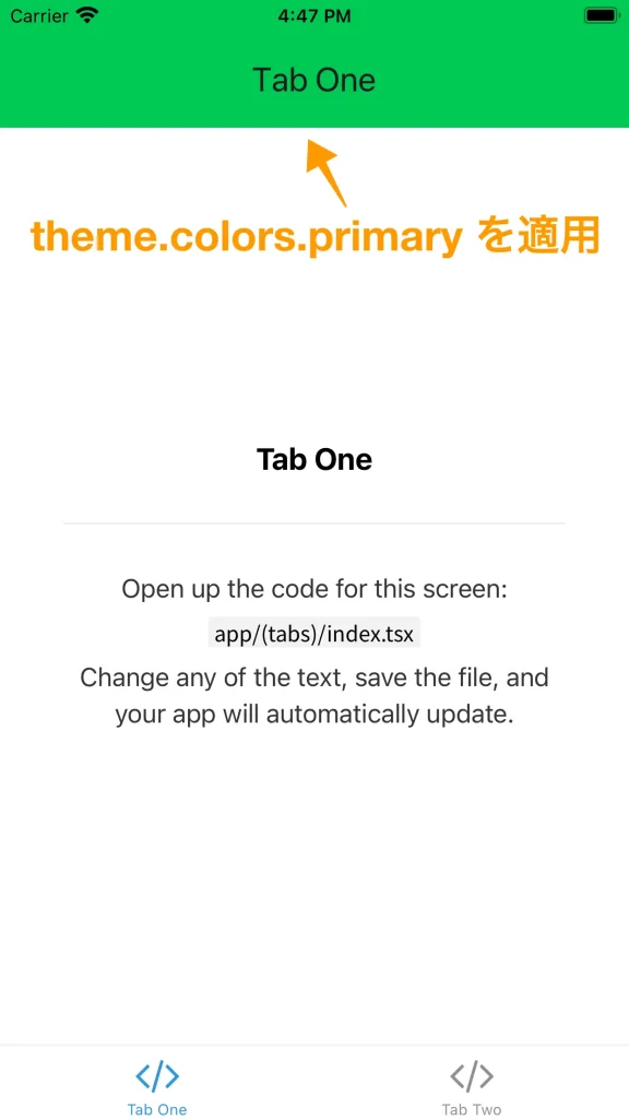
変化を確認するため、theme.colors.{primary|secondary}の値をMD2Colors.xxxに変更します。
- Line 3-7,15,16
ルートコンポーネントを、<PaperProvider /> でラップします。
- Line 59, 64
// app/_layout.tsx

import React, {useEffect} from 'react';
import FontAwesome from '@expo/vector-icons/FontAwesome';
import {
  MD2Colors,
  PaperProvider,
  MD3LightTheme as DefaultTheme,
} from 'react-native-paper';
import {useFonts} from 'expo-font';
import {SplashScreen, Stack} from 'expo-router';

const theme = {
  ...DefaultTheme,
  colors: {
    ...DefaultTheme.colors,
    primary: MD2Colors.greenA700,
    secondary: MD2Colors.amberA400,
  },
};

export {
  // Catch any errors thrown by the Layout component.
  ErrorBoundary,
} from 'expo-router';

export const unstable_settings = {
  // Ensure that reloading on `/modal` keeps a back button present.
  initialRouteName: '(tabs)',
};

// Prevent the splash screen from auto-hiding before asset loading is complete.
SplashScreen.preventAutoHideAsync();

export default function RootLayout() {
  const [loaded, error] = useFonts({
    SpaceMono: require('common/assets/fonts/SpaceMono-Regular.ttf'),
    ...FontAwesome.font,
  });

  // Expo Router uses Error Boundaries to catch errors in the navigation tree.
  useEffect(() => {
    if (error) throw error;
  }, [error]);

  useEffect(() => {
    if (loaded) {
      SplashScreen.hideAsync();
    }
  }, [loaded]);

  if (!loaded) {
    return null;
  }

  return <RootLayoutNav />;
}

function RootLayoutNav() {
  return (
    <PaperProvider theme={theme}>
      <Stack>
        <Stack.Screen name="(tabs)" options={{headerShown: false}} />
        <Stack.Screen name="modal" options={{presentation: 'modal'}} />
      </Stack>
    </PaperProvider>
  );
}
カスタマイズする
ヘッダーを <AppBar/> に変更します (app/(tabs)/_layout.tsx)
Appbar.Header の backgroundColor を colors.primary に設定します。
- Line 5,7,19-20,32-39
navigation.canGoBack() を使って、ReactNavigation の back Prop を代替できます。
// app/(tabs)/_layout.tsx

import * as React from 'react';
import {Pressable, useColorScheme} from 'react-native';
import {Appbar, useTheme} from 'react-native-paper';
import FontAwesome from '@expo/vector-icons/FontAwesome';
import {Link, Tabs, useNavigation} from 'expo-router';
import Colors from 'common/constants/colors';

function TabBarIcon(props: {
  name: React.ComponentProps<typeof FontAwesome>['name'];
  color: string;
}) {
  return <FontAwesome size={28} style={{marginBottom: -3}} {...props} />;
}

export default function TabLayout() {
  const colorScheme = useColorScheme();
  const {colors} = useTheme();
  const navigation = useNavigation();

  return (
    <Tabs
      screenOptions={{
        tabBarActiveTintColor: Colors[colorScheme ?? 'light'].tint,
      }}>
      <Tabs.Screen
        name="index"
        options={{
          title: 'Tab One',
          tabBarIcon: ({color}) => <TabBarIcon name="code" color={color} />,
          header: () => (
            <Appbar.Header style={{backgroundColor: colors.primary}}>
              {navigation.canGoBack() ? (
                <Appbar.BackAction onPress={navigation.goBack} />
              ) : null}
              <Appbar.Content title={'Tab One'} />
            </Appbar.Header>
          ),
          headerRight: () => (
            <Link href="/modal" asChild>
              <Pressable>
                {({pressed}) => (
                  <FontAwesome
                    name="info-circle"
                    size={25}
                    color={Colors[colorScheme ?? 'light'].text}
                    style={{marginRight: 15, opacity: pressed ? 0.5 : 1}}
                  />
                )}
              </Pressable>
            </Link>
          ),
        }}
      />
      <Tabs.Screen
        name="two"
        ...
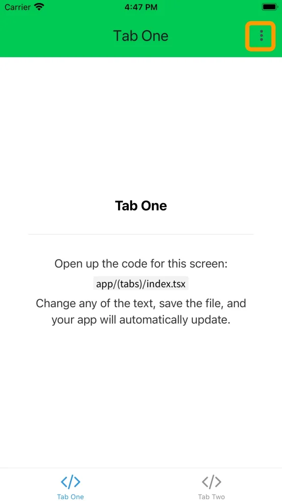
<Menu /> をヘッダーに追加する
- Line 5,21-23,41-68
// app/(tabs)/_layout.tsx
import * as React from 'react';
import {Pressable, useColorScheme} from 'react-native';
import {Appbar, useTheme, Menu} from 'react-native-paper';
import FontAwesome from '@expo/vector-icons/FontAwesome';
import {Link, Tabs, useNavigation} from 'expo-router';
import Colors from 'common/constants/colors';
function TabBarIcon(props: {
name: React.ComponentProps<typeof FontAwesome>['name'];
color: string;
}) {
return <FontAwesome size={28} style={{marginBottom: -3}} {...props} />;
}
export default function TabLayout() {
const colorScheme = useColorScheme();
const {colors} = useTheme();
const navigation = useNavigation();
const [visible, setVisible] = React.useState(false);
const openMenu = () => setVisible(true);
const closeMenu = () => setVisible(false);
return (
<Tabs
screenOptions={{
tabBarActiveTintColor: Colors[colorScheme ?? 'light'].tint,
}}>
<Tabs.Screen
name="index"
options={{
title: 'Tab One',
tabBarIcon: ({color}) => <TabBarIcon name="code" color={color} />,
header: () => (
<Appbar.Header style={{backgroundColor: colors.primary}}>
{navigation.canGoBack() ? (
<Appbar.BackAction onPress={navigation.goBack} />
) : null}
<Appbar.Content title={'Tab One'} />
{!navigation.canGoBack() ? (
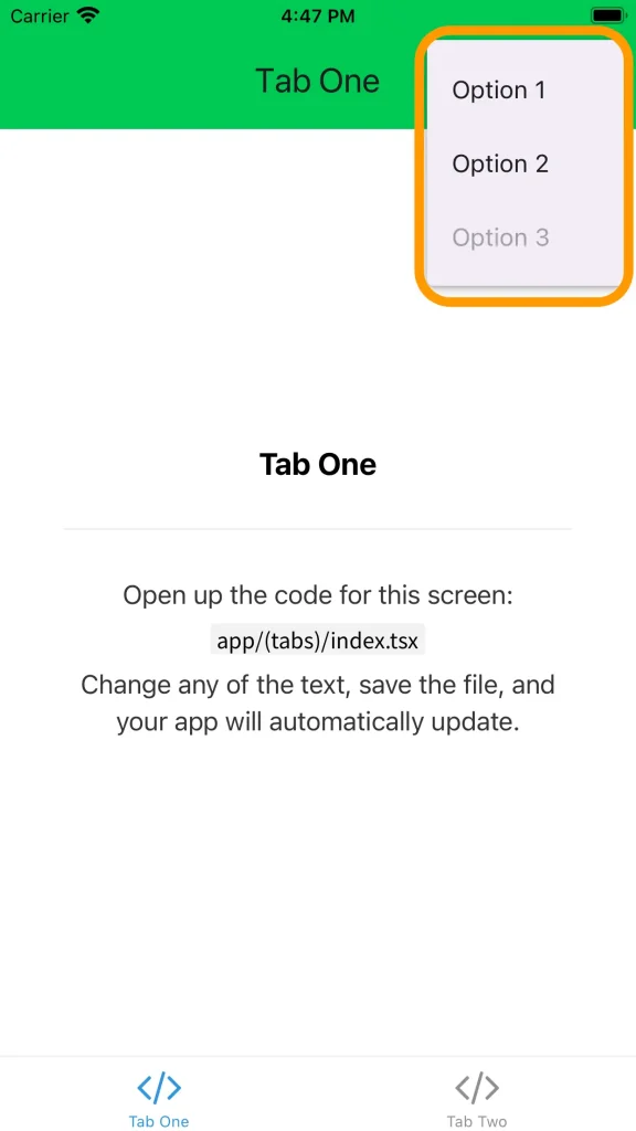
<Menu
visible={visible}
onDismiss={closeMenu}
anchor={
<Appbar.Action icon="dots-vertical" onPress={openMenu} />
}>
<Menu.Item
onPress={() => {
console.log('Option 1 was pressed');
}}
title="Option 1"
/>
<Menu.Item
onPress={() => {
console.log('Option 2 was pressed');
}}
title="Option 2"
/>
<Menu.Item
onPress={() => {
console.log('Option 3 was pressed');
}}
title="Option 3"
disabled
/>
</Menu>
) : null}
</Appbar.Header>
),
headerRight: () => (
<Link href="/modal" asChild>
<Pressable>
{({pressed}) => (
<FontAwesome
name="info-circle"
size={25}
color={Colors[colorScheme ?? 'light'].text}
style={{marginRight: 15, opacity: pressed ? 0.5 : 1}}
/>
)}
</Pressable>
</Link>
),
}}
/>
<Tabs.Screen
name="two"
...
おわりに
これで、React Native Paper + React Navigationと同じ環境で最小限の開発環境が作成されました。
※追記:設定の詳細記事はこちら(⬇︎)
コメント